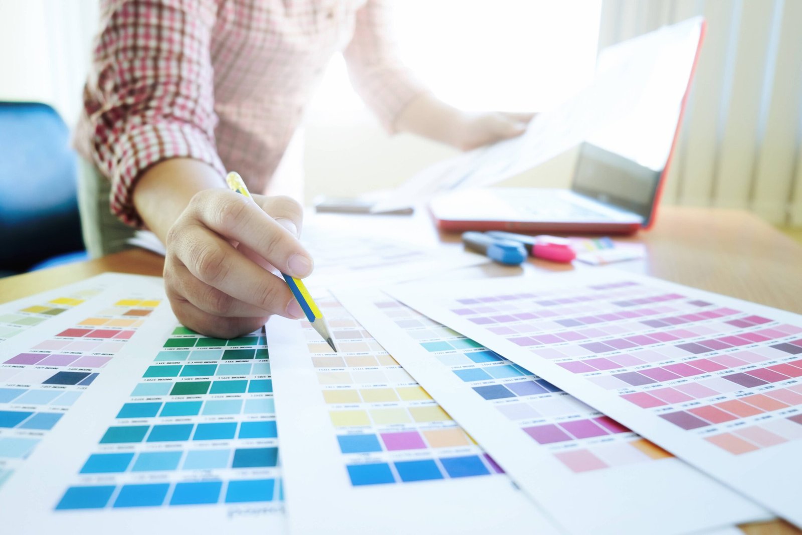
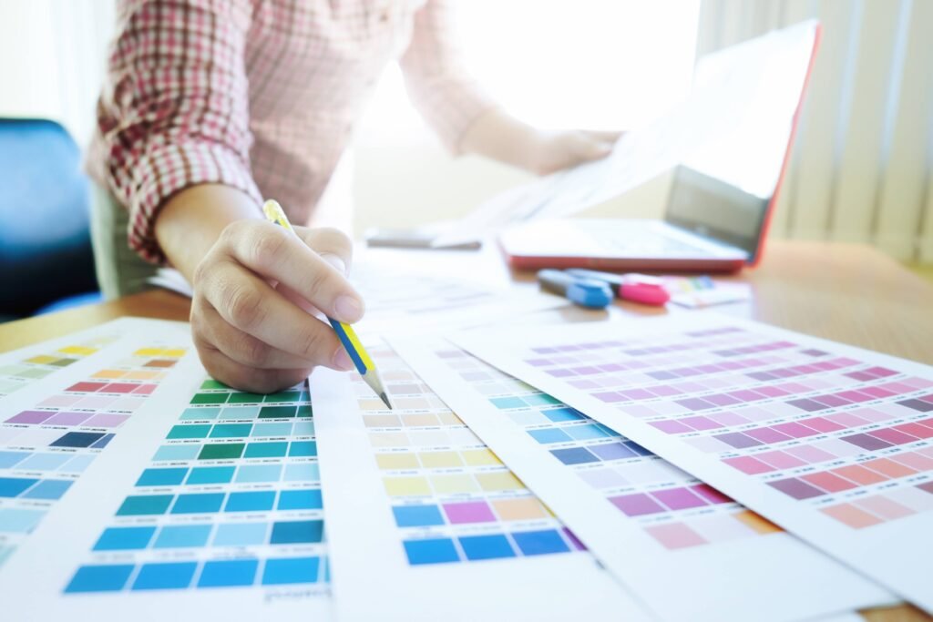
Pantone vs. CMYK Printing
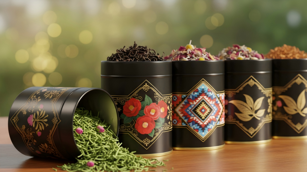
Printing plays an important role in custom metal tin packaging. High quality printing would make your brand stand out. One of the most common topics we discuss with our clients is the use of CMYK vs Pantone. They are both essential in printing industry.
What’s Pantone color?
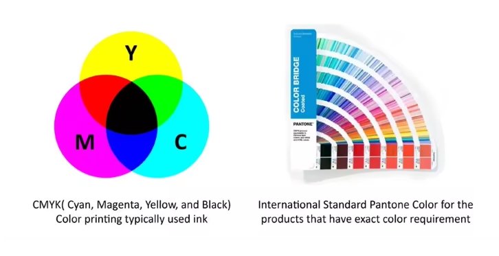
Pantone provides a universal language of color that enables color-critical decisions through every stage of the workflow for brands and manufacturers. In 1963, Pantone revolutionized the printing industry with the colorful PANTONE MATCHING SYSTEM, an innovative tool for the faithful selection, articulation and reproduction of consistent, accurate color anywhere in the world. The tool organizes color standards through a proprietary numbering system and chip format, which have since become iconic to the Pantone brand.
Pantone’s color language supports all color conscious industries; textiles, appreal, beauty, interiors, architectural and industrial design, encompassing over 10,000 color standards across multiple materials including printing, textiles, plastics, pigmets, and coatings. Pantone standars are available both digitally and physically.
What’s CMYK color?
CMYK color model also known as process color or four color is a subtractive color model, based on the CMYK color model used in color printing, and it also used to describe the printing process itself. The abbreviation CMYK refers to the four ink plates used: cyan, magenta, yellow, and key (most often black). The CMYK printing process was invented in the 1890s, when newspaper began to publish color comic strips.
The CMYK model works by partially or entirely masking colors on a lighter, usually white, background. The ink reduces the light that would otherwise be reflected. Such a model is called subtractive because inks subtract some colors from white light, in the CMY model, white light minus red leaves cyan, white light minus green leaves magenta, and white light minus blue leaves yellow.

What’s the difference between Pantone and CMYK?
The main difference between Pantone and CMYK printing is the level of accuracy when it comes to the final colors. The Pantone system will deliver the exact color every time, no matter who is printing or designing, whereas CMYK can result in slight color variances.
Feature | CMYK | Pantone |
|---|---|---|
Color Type | Mixed from 4 inks | Pre-mixed spot colors |
Color Range | Limited(can’t print neon/metallic) | Wider(includes special effects) |
Consistency | Varies by printer | Always the same |
Cost | Cheaper for full-color prints | More expensive (extra inks) |
Best for | Multicolored images | Logos, branding, main coverage area |
CMYK vs Pantone – which colour space should I use?
When clients design the artwork they shall have a question to choose pantone color (spot color), CMYK color, or Pantone mixed with CMYK. Here we shall discuss and share a guideline from different aspect.
Brand recognition
Pantone are best suited for logos and branding. Governments around the world have adopted the PMS to specify national flag colours for instance. Pantone color have precise color matching, vibrant hues and darker tones, special finishes including fluorescent and metallic colours.
CMYK is best suited for multicolour images. Most magazines and newspapers are printed using CMYK. CMYK uses a series of dots in the four colors to create images and colours. That method means that a wide variety of colours can be used in a small area. The limitation is that it can not produce the same vibrancy that can be achieved with Pantone. The other side is consistency; CMYK colours can look different on each printer and even within the same file.
Budget
Print quality is generally much better and more accurate with pantone compared with CMYK. However, cost is different. Pantone- you pay per number of colours and also by coverage area.
Production
Each pantone color have a CMYK guide colors. For pantone color printing is would be easier to handle and quality precise. CMYK printing which would depend on printing worker’s rich experience and adjust each color ink to follow CMYK guide colors. Relatively speaking, Pantone printing is more easier than CMYK process.
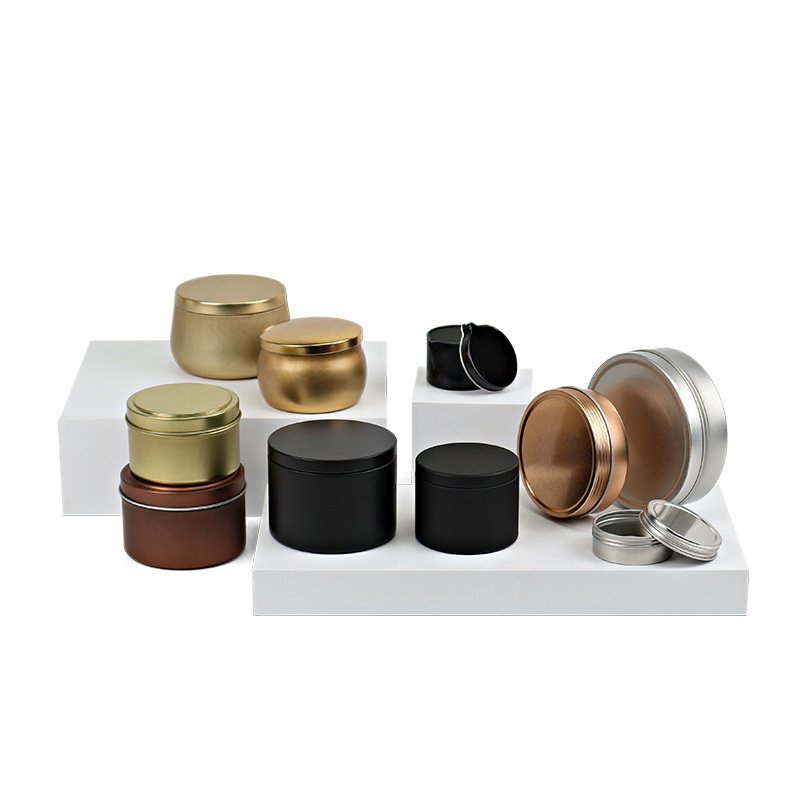
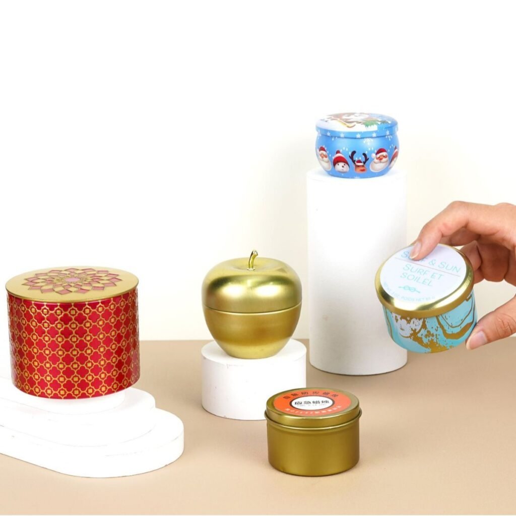
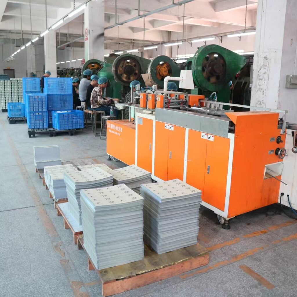
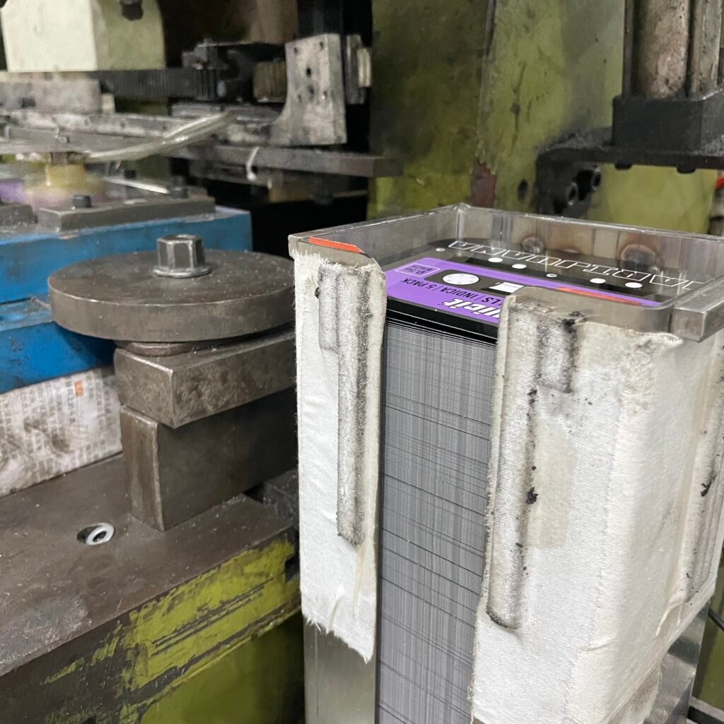
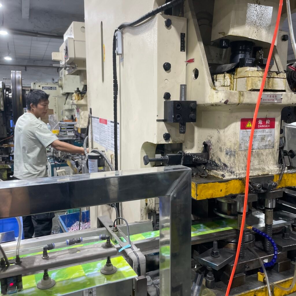
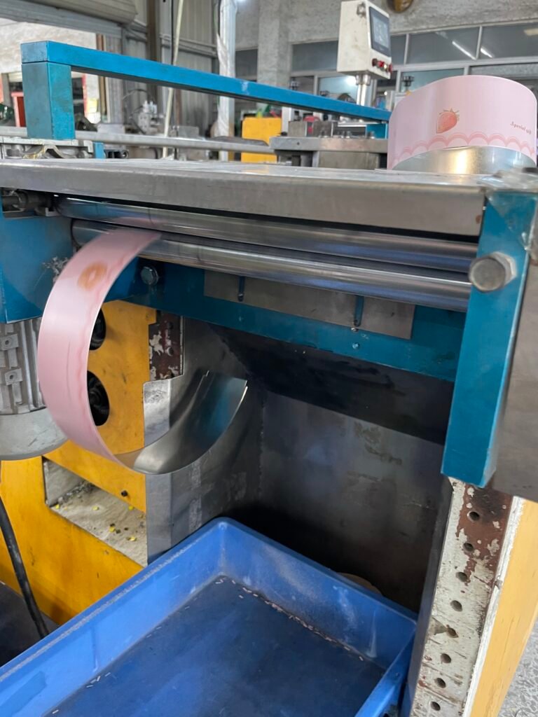
How to print tin box?
Tinplate printing is finished on the printing iron production line and this line comprises feeding equipment, offset printing unit, coating unit, drying room and film-receiving equipment.
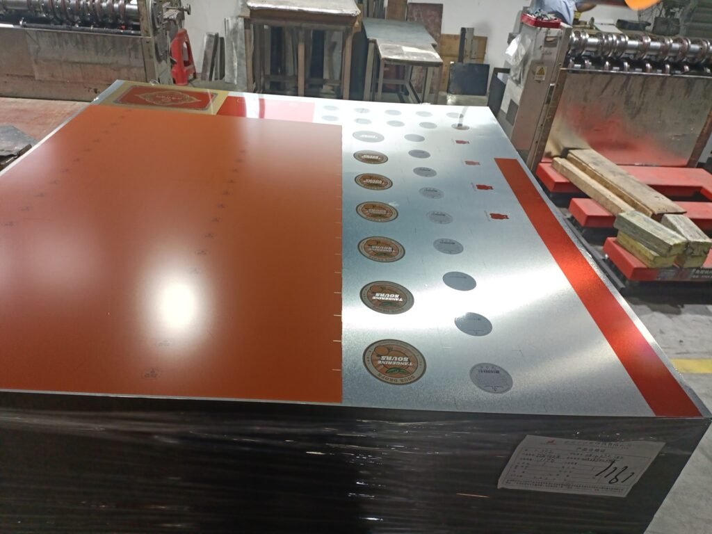
Printing plays a vital role in metal tin products especially packaging. We generally proceed tin plate sheet with custom printing firstly, then canned with production process bending, stretching, flanging and others which require high strength and adhesion to prevent the coating film and ink layer from being deformed, cracked, or even falling off from the tinplate. Therefore a layer of paint is essential between tinplate and ink to approve adhesion.
Learn More: How To Print On Metal Packaging
What’s the difference between CMYK tins and Pantone color tins?
Below is the two tins which is printed by pantone color and CMYK colors. People can easily recognize from appearance. CMYK color tinplate you can see a wide range of colors by mixing tiny dots. Pantone color would look more solid.
 Pantone + CMYK
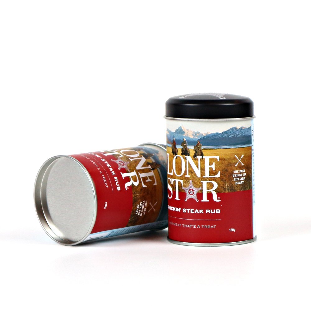 CMYK
CMYK
What’s the suggestion for custom printed tins Pantone color VS CMYK color?
Pantone is best suited for: | CMYK is best suited for |
|
|
When we get client’s design, we usually recommend pantone color for the main coverage area to make sure color consistency for tin box lid, body and bottom especially for large tin box. Even though for a tin box, lid, body and bottom printed tinplate on the same tinplate sheet while for CMYK process, color vibration exist. We would suggest multicolour images printed by CMYK colors and the main coverage area by pantone color to avoid color difference between top lid, body and bottom. This would cost less but achieve a good quality printing.
Is there limitation for pantone colors on one tinplate sheet printing?
Considering color quality, we would suggest a maximum of 5 Pantone colors or less being used. As each Pantone color printed on tinplate, it shall go through drying room. If over 5 Pantone colours which means tinplate would go through drying room more than 5 times that would affect Pantone colors quality. In addition, printing cost would increase if more Pantone colors required.
offset Printing Customization
In conclusion
With the improvement of printing techniques, today Pantone and CMYK both can achieve good printing quality. The majority of our projects are suitable for printing in CMYK, others require the use of Pantone or Pantone mixed with CMYK. You can choose to combine these colors in your design to get the best idea with lowest cost. Contact Tinspkg, we shall give you our professional suggestion to realize the best result.